Monday, 14 April 2014
Graduation!
So I've finally got my graduation in a couple of weeks! It's been an interesting journey and I'm glad I've done it, I'll leave this blog up so I can revisit it sometime in the future and look back on some of the things that I've done!

My 5 Artefacts.
The images should link to a live survey, feel free to fill in the fields if you really want, it can't hurt if I want to go back and see if even larger sample pools change the results at all.
(links will be added soon)
Artefact 1:
 Artefact 2:
 Artefact 3:
 Artefact 4:
 Artefact 5:

(links will be added soon)
Artefact 1:

Monday, 27 January 2014
Taking back Tuesdays- The Dominoes campaign.
The brief (for my personal use, so I don't have to go digging around the internet to find it.)
In 2009 Domino’s Pizza launched Two For Tuesday – buy one pizza get one free every Tuesday. The launch proved a major success, doubling average sales on a Tuesday. In July 2010 Pizza Hut launched Two’sday Tuesdays, and in August 2010 Papa Johns also launched Two For Tuesday.
We would like to reinvigorate and recharge the Two For Tuesday offer, not reinvent it. We want Domino’s to be to Tuesdays what Orange is to Wednesdays.
The creative challenge is to develop an attention grabbing campaign that achieves this.
Consider how would you re-launch Two For Tuesday back into the bellies of pizza eaters across the UK. Also, how would you amplify this locally?
What’s the best name for the promotion and your campaign? Is there a great idea for a deal mechanic? Are there seasonal opportunities that can be exploited, such as Pancake Day or other iconic times?
Feel free to explore digital, press and outdoor, experiential ideas or any other formats, contexts and media that you think will grab the attention of the right audience.
In 2009 Domino’s Pizza launched Two For Tuesday – buy one pizza get one free every Tuesday. The launch proved a major success, doubling average sales on a Tuesday. In July 2010 Pizza Hut launched Two’sday Tuesdays, and in August 2010 Papa Johns also launched Two For Tuesday.
The Creative Challenge
Two For Tuesday is no longer able to differentiate Domino’s from our competitors, and as such Tuesday ownership has been relinquished.We would like to reinvigorate and recharge the Two For Tuesday offer, not reinvent it. We want Domino’s to be to Tuesdays what Orange is to Wednesdays.
The creative challenge is to develop an attention grabbing campaign that achieves this.
Considerations
Increasing Tuesday penetration is key to any proposal. Excluding the offer and the day, nothing else is sacred - including the name. Your response must reflect the Domino’s tone of voice - cheeky, surprising, honest and reliable.Consider how would you re-launch Two For Tuesday back into the bellies of pizza eaters across the UK. Also, how would you amplify this locally?
What’s the best name for the promotion and your campaign? Is there a great idea for a deal mechanic? Are there seasonal opportunities that can be exploited, such as Pancake Day or other iconic times?
Target Audience
18 -34 year olds of both sexes, many of whom will be students.Media
You are free to bring your campaign to life using any specific medium, or combination of media, that you think will best connect with the target audience in the times and places that they will be most receptive to it.Feel free to explore digital, press and outdoor, experiential ideas or any other formats, contexts and media that you think will grab the attention of the right audience.
Mandatories
- You must use the Domino’s logo
- Adhere to Brand Guidelines
- Mechanic requires Two Pizzas (you must not change this part of the mechanic)
Sunday, 24 November 2013
Wrapping things up for Client project 1!
Watch this space for the finished upload, otherwise, keep your eyes on my Work In Progress Blog for the general workflow.


Sunday, 20 October 2013
Final Year!
So, at the moment I have 2 (3) projects running in parallel!
Firstly, I have my Assigned client project, which is to complete a submission for the Young Creative Award's "Nottingham Loves.." competition.
I'm looking to create a piece of animation that uses Street art and frame-by-frame animation to create something cool and new!
Check out some of the stuff I've been shooting:


Secondly, I also have my Research project, which focuses on how sexuality is presented through design and animation decisions. I'm currently working on a hypothesis for this research.
Finally, I'm getting into the monthly Polycount competitions for the Steam workshop for DOTA2, an online game, this should allow me to continue my creative journey in a more global setting, where I can receive criticism and view work from others from outside of my current environment, and maybe even make some money!
So yea, that's what's cooking right now, make sure to check out my Work In Progress blog for more regular updates!
Saturday, 15 June 2013
Working through the freddiew compositing tutorial- check this out :)


first initial render without indirect illumination turned on.
second attempy, indirect illumination turned on, texture not applied to walls.
final render for this batch, will be using the balls/shadows for comping with, so the background doesn't matter so much in this case, though it's something I'd like to look into.
Tuesday, 4 June 2013
Working through the 3DSMax tutorials!
Here's my first one, the Battlefield animation, very basic but I'm just going over everything seeing if there are any bits and bobs that I can use to improve my workflow.
Saturday, 1 June 2013
Summer Break
I figured that I'm going to need to get some serious work done over the next few months, in order to really step up my game to the level of the competition that I've seen in final-year showreels and submissions from other Universities.
My goals are including but not limited to:
My goals are including but not limited to:
- Become fully proficient with working between Mudbox and 3DSMax.
- Be able to produce high quality textured models, with all of the extra layer modifiers to make them really pop.
- Work on designs and models for the DOTA2 store, to get exposure and maybe even a bit of money on the side.
- Attempt to do some of the other briefs that Uni gave out last term.
- Join the 11-second club and become an active participant.
- Become an active participant on some of the CG/Animation/Art forums online.
- Enjoy my work!
Sunday, 19 May 2013
Final render and Project rational
Here is the Video that I submitted
Project Rational:
"Character Design, visual style and functionality" was one many choices of brief that we were allowed to pick, I chose this one in particular since I find the field of character design and animation of great interest, and whilst the "Body Dynamics, weight and impact" looked like a lot of fun, and "Character animation, dialogue and communication" looked like a great chance to explore the aspects of delivering a believable performance in CG, I felt that the former would allow me to explore away from the bipedal, life based models that I've been used to working with so far.
I relished the challenge of finding only three out of hundreds of possible characters from Neil Gaiman's Sandman. Finally choosing the trio of Guardians from Dream's fortress. My reason for picking the guardians is that it would be a unique challenge to attempt non-biped models for the first time, and by taking on three different models, I felt that I could iterate a first attempt, and continually improve through subsequent iterations.
I did a great deal of sketching for each of the three guardians, which were the Wyvern, the Hyppogriff and the Griffon. The Wyvern was a pleasure to re-imagine, as there are a great many ways to reinterpret a creature such as a dragon, and I experimented with lots of shapes and proportions in my pre-design sketches, which were done loosely in Photoshop.
However, when it came to redesigning the Griffon and Hyppogriff, there was a bit less leeway, since source material inferred that the two creatures were physically similar, yet I wanted to create designs that gave each one an individual vibe by exercising some artistic license with my design choices.
During the course of modelling the characters, I explored different ways to model functional wings for each of the characters, my favourite outcome being that of the Wyvern, which, whilst heavily stylized and physically impossible, had an overall aesthetically pleasing wing design and flying animation, though I did run into some issues with attaching cloth groups to CAT-bones, an issue that I would like to revisit again in my spare time.
Luckily, the internet and media has a great deal of relevant source material, I sought this in the form of aviary flight videos, natural world photography and special effects predecessors that tackled similar subject matter such as "Walking with Dinosaurs, BBC".
Thankfully I had learn a lot of lessons since the last project, and whilst time management was somewhat of an issue again (Due to external circumstances) I felt that I'd coped better than previously in terms of budgeting my time to fit deadline constraints, and made best use of the informal extension to fiddle out some of the creases in my work so to speak.
Thankfully the rendering checklist idea paid off and I managed to get it all rendered and edited within good time, with no hitches!
My goal next term is to expand my horizons and explore more rigorous lighting, texturing and rendering settings, as I now have much more robust hardware to cope with the stresses that I aim to throw at it.
Over the summer I aim to produce some high quality model assets with the assistance of Polycount.com, and maybe even get some exposure in the modelling and animating community.
Monday, 18 March 2013
Project 3!
Here's the brief that I picked:
Character Design, visual style and functionality… Task 3:
Redesign Model and demonstrate 3 functional animated characters From Neil
Gaiman’s Graphic novels that centre around the Sandman character.
Here's what I intend to do this term:
I'm going to look at reinterpreting and designing the three guardians of Dream's castle- The Wyvern, Hyppogriff and Griffin.
I like how I can take reference and inspiration from both classic and contemporary literature and media, and take a path towards more expressive design with creatures rather than modelling more humanoid characters.
I'll also relish the challenge of creating animations and breathing life into these creatures.
Keep up with more frequent updates on my work in progress blog.
Wednesday, 27 February 2013
And the paddington project is finished!
And my rational:
“In the style of” gave us the opportunity to extend our
creative knowledge in a way that allowed us to come up with novel twists on
original ideas, but also aesthetically followed a pre-requisite style.
This presented a number of issues from the offset, since
it would be an interesting challenge to create a piece of animation that didn’t
just feel as though it were ripping off the original content, and acted instead
as a homage rather than a copy.
In order to do this I would need to pick the right IP to
reboot in the style that furthered the narrative most effectively.
Primarily I watched each of the available original
cartoons for Paddington, TMNT and Roobarb- Immediately I felt that I could draw
parallels between the original British version of Paddington, with its cut-out
backdrops and charming stop-motion animation, and the desaturated, recycled style of ‘The Lost Thing’.
I also liked that the characters in this sketch had
stylised limb proportions, which I felt could translate well to possible bear
concepts.
At first I did a number of facial sketches for Paddington
(see my WIP blog) in order to get a large visual reference pool from which to
select and adapt an original and exciting concept, after that came the body-
which was designed with modelling in mind, or rather with a challenge in mind.
When it came to modelling the bear in Max, I learnt many
things through dodging and occasionally falling into pitfalls along the way,
for instance I found that using a symmetry modifier on a subdivided object
seems to bake in the subdivisions, which is at best frustrating, and at worst
an absolute farce when it came to exporting to Mudbox for texturing and
details.
Thankfully, I managed to get a model that was workable,
and when it came to designing a secondary model for the little old lady
afterwards, I breezed it in a fraction of the time and produced a clean, simple
model that exported and edited inside mudbox like a dream.
It was also helpful to learn and practice with CAT
rigging, again I had a few issues when building the bear, but by the time I got
round to modelling the lady, things were much smoother and I had a clear idea
of what to do and how, though next time I would like to explore the application
of morph targets and see whether they are compatible with CAT rigs.
Yet again I found that rendering is something that should
be done with a notebook and checklist at hand, especially if it happens to take
place at silly-O’clock in the morning (Gotta get those stills rendered whilst I’m
asleep- efficiency!)
I found that the post production knowledge that I’d
picked up was very useful, though I had a lot less time available for post that
I would’ve liked, due to personal deadlines being somewhat flexed in the run up
to the solid deadline, overall I was pleased with the result and can hopefully
fully master the art of a comfortable timeline during the next project!
Thursday, 6 December 2012
The concepting phase has begun for project 2!
Check out my work in progress blog for more frequent updates:
Otherwise, wait/check here until some more substantial renders, bits and bobs turn up!
Otherwise, wait/check here until some more substantial renders, bits and bobs turn up!
Friday, 16 November 2012
Project 1 Rational
The steampunk chess robot project asked us to design,
build and animate a Chess robot and its environment in the steampunk visual
style, and whilst the brief asked for a limited “set”, I made the decision to
use a slightly more versatile street setting, as I felt that an alleyway could
feel more industrial and contemporary to the brief.
I took in a number of inspirations, and thankfully
steampunk was a theme I was vaguely familiar with already thanks to films such
as “9” and “Howl’s moving castle”. Other inspirations included an unusual piece
“future forms of life”- David Lance, which featured a strange shuffling
biomechanical beast, and somewhat influenced my animation angle regarding my
steampunk spider.
During the project I came across a number of challenges
and issues, each of which was overcome through problem solving and internet
searches. For example, the scale of the set required me to create separate
instances in which I could efficiently render separate scenes without having to
worry about extra lights and artefacts slowing down the rendering process.
Another technique that I used to maximise productivity
was to only render whilst I was asleep, I’d check the first few frames, then
when I woke I’d have the full collection of stills from which to make an
animation.
However this worked against me at one point as I’d accidentally
selected the “perspective” render view, and wasted 4 hours rendering the entire
animation from one angle. Thankfully, I learned from this mistake.
Another approach I took to make the scene more cinematic,
but avoid overcomplicating the scene for myself, was to only use a single
camera, and to use key framing in such a way that to the audience it would seem
that the shot had cut to another, separate one.
Similarly to this, I struggled with a certain linking
constraint- where a chess piece refused to be unlinked from a hand constraint,
so I made the decision to splice it out of the shot at a certain point, and
stitch in a copy in its place. This worked well.
One issue that I would like to overcome is the way that I
textured my objects, I’d like to be able to map textures onto surface in a way
that looks entirely convincing, rather than just adding bump maps and using a
simple UVM map modifier. I hope to achieve this by practising with the Unwrap
UVM modifier.
Secondly, I believe that despite the cinematographic
aspects of my final animation, my use of pacing and timing could use some
refinement, I’ll look to address this through practise and exploring other
examples to see how they tackle this.
One aspect that I would like to improve on is the way
that a character has ‘character’, after seeing other examples I realise that
there are certainly ways of effectively adding depth and strength to a character
profile, in similar ways to Pixar and Dreamworks.
Overall I am pleased with the outcome, though next time I’d
like to aim for completing the project well before deadline in order to add
more post-production time to refine and polish the work into another level.
Sunday, 11 November 2012
Spider robot introduction shot is done!
I've completed the intro section to my 'Steampunk chess robot' animation, It's currently rendering and the 20 second animation should be on here within an hour.
Friday, 9 November 2012
Feeling handy

(thumbs up for forgetting to turn on smoothing >.<)
I've also remodelled the robot's torso, as I'd made the silly mistake of scaling the entire object instead of scaling its vertices (one of the first notes I'd made was to "Only ever scale sub-object stuff")
Playing around with textures and bump maps is rather interesting too!
Thursday, 8 November 2012
ImagineFX is amazing!
In between creating robot designs, I've been reading and downloading tutorials from a bunch of IFX magazines that I bought a couple of months back, the info and resources are highly recommended!
I've already found a bunch of perfectly suited textures for my steampunk animation, and am in the process of ripping the data across from all of the disks (over 40 to get through!)
I've already found a bunch of perfectly suited textures for my steampunk animation, and am in the process of ripping the data across from all of the disks (over 40 to get through!)
Wednesday, 31 October 2012
Website update is live
Check out the revamped site, now with a Work in Progress (WIP) section, fresh graphics and simple UI!
http://jbmcbride.com/
http://jbmcbride.com/
Tuesday, 30 October 2012
Refurbishment of JBMcBride.com underway.
Here's an inital comparison between current and new, expect plenty of nicer graphics and design choices by Thursday!


Tuesday, 23 October 2012
Early iterations for my robot in 3dsmax
Heres a screenshot of my workspace, including the beginnings of a robot head+ref material.
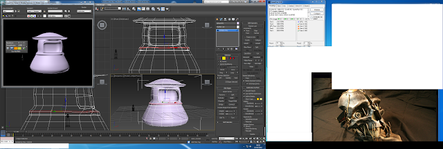
And beginning to work on a torso, going to take a break from that and build some arms/legs


And beginning to work on a torso, going to take a break from that and build some arms/legs

Subscribe to:
Posts (Atom)